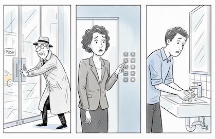

If you’ve ever walked up to a door, pulled with absolute confidence, and discovered it was meant to be pushed, you’ve met the now-famous “Norman Door.” Don Norman, the cognitive scientist who popularized the term, used it to spotlight a certain kind of design crime: an object whose signals mislead the user. A pull handle on a push door. A push plate on something you must pull. The sort of design that looks intuitive but invites failure.
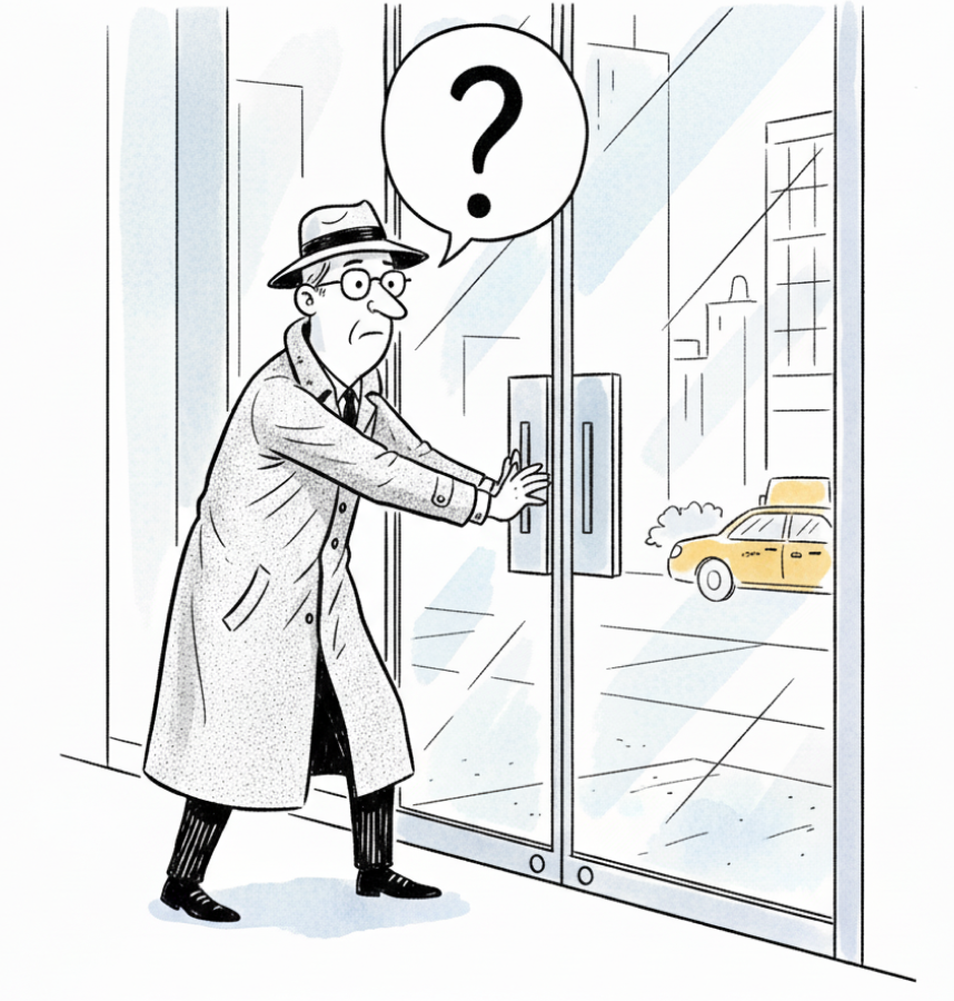
The urban enigma: a push-pull conundrum
Most of us laugh it off—a tiny, human moment of awkwardness usually witnessed by someone pretending not to notice. But hidden inside that laugh is a much larger lesson:
The Norman Door isn’t usually the result of a malicious designer. It’s almost always the byproduct of indifference—someone assuming users will “figure it out,” or prioritizing aesthetics over usability, or working in a silo where no one feels accountable for the full experience. In that sense, the Norman Door is everywhere: in our software, in our processes, in our paperwork, and inside every organization that tolerates friction because “that’s just how things work.”

When you need an engineering degree to get to your most important need
Where Norman Doors Hide in Everyday Life
The most common modern Norman Door is software. If a supposedly simple workplace tool requires a 40-minute tutorial before anyone can use it, the problem is not the people—it’s the design. The best tools fade into the background; the worst demand attention at every step.
Then there are digital forms stuffed with unnecessary fields. Each extra field adds friction: more typing, more decisions, more fatigue. It is the equivalent of a door whose handle begs you to pull when you must push. A small mismatch that multiplies across hundreds of users and thousands of interactions.
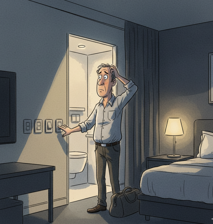
Ah, the hotel room light switch challenge
Organizational processes do it too. A task requiring four approvals and two emails may appear to ensure accountability, but in practice it slows everything down. Complexity masquerades as rigor when, in reality, it’s simply a momentum tax.
Even physical spaces fall into this pattern. The single printer in a far corner. The meeting room with no power outlets. The bathroom key attached to an oversized wooden paddle for no discernible reason. Small moments, all of them, but collectively they shape how people feel about their work—and about the organization itself.
The Quiet Price of Bad Design
Most leaders underestimate how costly friction truly is. Research on cognitive load and productivity shows that even small interruptions accumulate. Every extra click, every redundant step, every confusing interface pulls attention away from the work that matters.

Everyone loves long tutorials — not!!!
The effects ripple outward: delays, errors, rising support costs, employee frustration, disengagement, and burnout. Bad design erodes morale and performance long before anyone can name the cause.
Why Good Design Is a Leadership Skill
Good design isn’t cosmetic. It’s strategic. It’s the difference between an organization that accelerates and one that grinds. Leaders who take design seriously understand that clarity is not decoration; it’s care. Simplicity is not basic; it’s mastery. Ease of use isn’t a luxury; it’s a competitive advantage.
At Spryng, this belief shapes everything—from coaching flows to communication pathways to the core philosophy of a Frictionless Organization. When something feels intuitive, people engage. When it feels confusing, they withdraw. It’s that simple, and that profound.
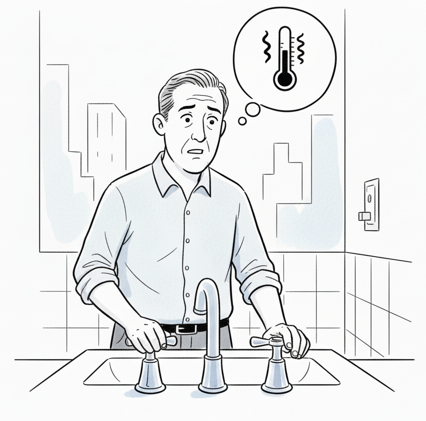
The UK faucet challenge (if you know you know)
Which of these everyday Norman Doors bothers you the most?
Fixing Even One Thing Matters
Eliminating a single Norman Door—one workflow, one form, one screen, one tiny point of friction—changes how people feel. They feel the clarity. They feel the respect. They feel the difference between a system that considers them and one that doesn’t.
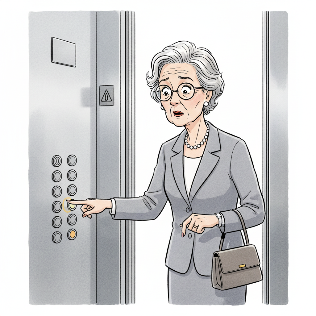
You would have thought that elevator manufacturers would have eliminated confusing interfaces by now
Good design rarely announces itself. It doesn’t need to. It reveals itself in fewer frustrations, smoother days, and people who have more energy for the work that matters.
That’s why design matters.
That’s why we build Spryng the way we do.
And that’s why the organizations of the future will be the ones that take friction seriously.
If you have a little over five minutes watch this Vox video on the Norman Door and it's history. It's not you. Bad doors are everywhere